3 rules of harmonious interior
Although interior decoration is one of the final stages of a design project, it is also one of the most important. Decorative elements may be beautiful in themselves, but if the principles of styling are ignored, they can fail to improve a room and may even create visual imbalance. In interiors that feel psychologically warm and comfortable, every detail — and the way it is placed — appears natural, organically integrated into the rooms design and perfectly coordinated with the surrounding elements.
Thoughtful decoration allows bright colours to be perceived without visual tension, or, conversely, can transform a monochrome grey interior into an elegant and stylish space. There are certain rules that can help you create a harmonious design in your own home or make the right adjustments to rooms that already exist.
Rule 1: Balance Decorative Elements
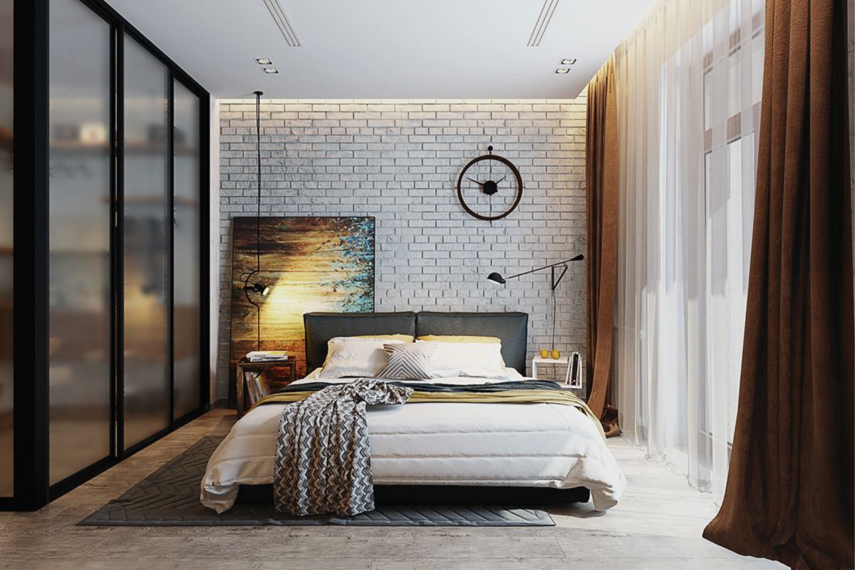
Harmony in an interior is impossible without balance between its individual components. The size of each object should be considered when determining its ideal position within the room. Balance should be pursued in several directions at once:
1. Match the scale of the furniture to the size of the room
Large, bulky furniture should not be used in small rooms, as it will visually make the space feel even smaller. In the same way, small pieces of furniture should not be placed in spacious rooms, where they simply get lost and lose their visual impact.
2. Use the “seesaw” principle when arranging furniture
Furniture in any room is never all the same size. Tall cabinets stand beside low beds and daybeds; wide sofas are paired with small ottomans; massive bookcases may be balanced by elegant mini bars; bunk beds in children’s rooms are often placed near low play tables, and so on. To achieve harmonious interior styling, large and small objects should alternate so that the eye moves up and down across the furniture, following the principle of a seesaw. If this principle is ignored, the room will appear visually “tilted” toward the area where the larger pieces are concentrated.
3. Arrange furniture correctly within the room
Homeowners often make the mistake of placing large furniture along the walls while leaving smaller items in the centre of the room. Visually, such a room almost always looks untidy, because small objects create a sense of clutter. Try placing a large bed in the central part of the bedroom, a substantial desk in the office, or a generous sofa in the living room, while positioning smaller side tables, cabinets, and decorative pieces closer to the walls. You will immediately feel how much more inviting your rooms become.
Rule 2: Use Contrast in Decoration
Contrasting colour combinations bring a design to life. The right choice of contrasting shades can add an exclusive touch to an interior and give the room individuality. At the same time, it is important to avoid overloading the space with too many contrasting elements, as the result may be unpleasant and may even create a feeling of discomfort and disorder.
Almost any interior detail can be used as a contrasting element, from textiles to door panels or even book bindings. Contrast can be sharp or soft. To find the most suitable contrasting shade, you can use a colour wheel.
If your interior has one dominant colour, the best contrast will usually be the opposite shade on the colour wheel. If the colour palette is built around two or three shades, choose a contrasting colour using the triangle or quadrilateral principle.
The art of combining different colours is a whole science, and designers spend years studying it. But you do not have to spend that much time on it: here are six universal tips for combining different shades in an interior.
Blue works well with red, orange, white, and green. Terracotta looks harmonious with bright green accents and lime shades, creating a cheerful mood. A combination of pale blue and cream works beautifully in rooms with little natural light, adding comfort and visual softness. Yellow is often associated with joy, but it is almost never used as the dominant colour. It can be successfully combined with a neutral palette: grey, beige, and white. If you want more brightness, raspberry, vivid blue, or grass green will help. Deep green and emerald tones combine beautifully with red, while muted turquoise works well with neutral beige and white. Pink shades are always more complex, but they can also be handled successfully. If a bright palette is chosen, beige or white can be added to pink; muted or dusty pink pairs beautifully with dark blue.
By the way, the simplest solution is to make the background white. Almost any colour can be combined with it, and contrast can be used to create an interesting eclectic interior.
Rule 3: Create a Rhythmic Pattern
The technique of rhythmic repetition in interior decoration is used to bring separate objects together into one harmonious ensemble. A rhythmic pattern is created by repeating the same decorative element in different parts of one room.
Various methods can be used to create this rhythm: alternating columns, repeating identical furniture pieces, using wallpapers of different designs, placing vases of similar style, choosing matching picture frames or interior photo frames, repeating the design of sofa cushions, and more.
The elements that form a rhythmic pattern should be clearly visible and should attract attention. The easiest way to draw the eye is to choose décor with an original texture, a bright colour, or a sufficiently large scale. Sometimes smaller elements can be emphasized with directed beams of light. Decorative elements used to create rhythm should not appear in excessive quantities, otherwise a harmonious rhythm can quickly turn into chaos.
To combine materials successfully, it is important to follow several principles. In one interior, it is better not to combine several finishing materials with the same surface effect, such as natural wood and laminate, or ceramic tile imitating wood together with the same laminate. The main rule of combining textures is contrast and harmony: smooth surfaces work beautifully with relief; solid wood pairs well with soft upholstery. If a room is divided into zones, it is ideal to use finishes with different textures for each zone.
Try evaluating your own rooms according to these rules. Perhaps it will be enough to replace some cushion covers, rearrange books on the shelves, change photo frames, or move vases to new places in order to noticeably improve the emotional perception of your home. Do not be afraid to change a familiar setting: even simple decorative updates can make a home far more comfortable, welcoming, and beautiful.